Tex-Shield

This is an ad for protective clothing made by Tex-Shield. I helped work on the layout of the text, colors, and images in this ad.
posted by Ali Piacente @ 2:11 PM
0 comments
![]()
![]()
E-mail: alpiacen@gmail.com Phone: 301 938 6852
I am a UNC Charlotte graduate with a BA in Art (Graphic Design). I also have a minor in Computer Science and Art History.

posted by Ali Piacente @ 2:11 PM
0 comments
![]()
![]()

posted by Ali Piacente @ 2:05 PM
0 comments
![]()
![]()

posted by Ali Piacente @ 2:04 PM
0 comments
![]()
![]()
 Classified ad for American Mortgage -- I worked on the layout for this ad while interning at August, Lang, and Husak.
posted by Ali Piacente @ 2:01 PM
0 comments
![]()
![]()
http://webpages.uncc.edu/~alpiacen/photosketch/
posted by Ali Piacente @ 1:22 PM
0 comments
![]()
![]()

Digital photography gives so much freedom for a photographer to play with color, texture, and scale. This project focused on scale, and our class' work will be displayed in downtown Charlotte in an exhibit. My project dealt with the psychology of tennis and how much it impacts competition. The tennis team has been seeing a tennis psychologist and we have focused on things like visualization, positive and negative thoughts, and relaxation techniques. 90% of tennis is psychological while the other 10% is physical. There is a reference to the ink blot test and repitition of the tennis player to show the importance of the mental side of tennis that visually and figuratively overwelm everything else.
posted by Ali Piacente @ 9:21 PM
1 comments
![]()
![]()
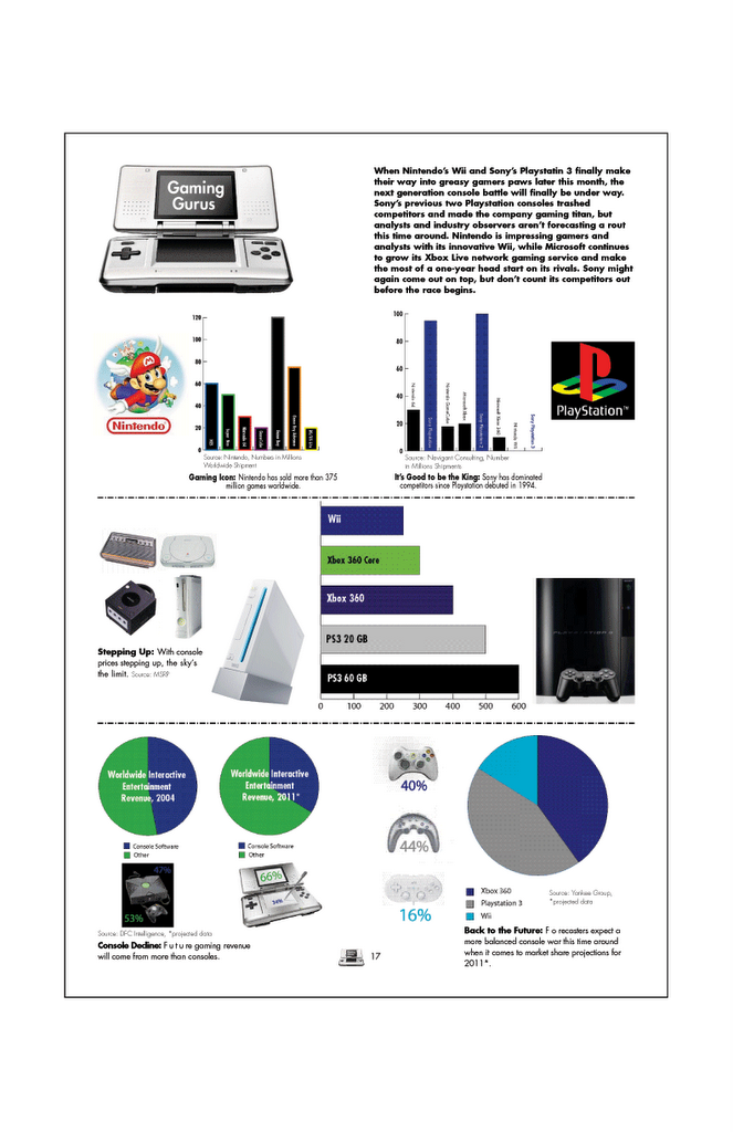
The Information Design project was to create a page layout for the "Gaming Gurus" text and statistics. My concept was to create a history diagram going from past, present, and future of gaming. The colors in the design are based on game colors used for Playstation and Nintendo games.
posted by Ali Piacente @ 11:11 AM
0 comments
![]()
![]()

HepatoSys is a company that specializes in the regeneration of livers used for transplanting into patients with liver disease. HepatoSys created a solution used to pump fluid into the liver to lengthen the life of the liver.
My logo for HepatoSys features an abstract shape of a liver, which is commonly depicted by triangles. My logo uses two triangles, one darker, one lighter, in reference to the "bad" and "good" liver. The color is reminicent of the process which uses fluid to regenerate the liver.
posted by Ali Piacente @ 2:20 PM
0 comments
![]()
![]()
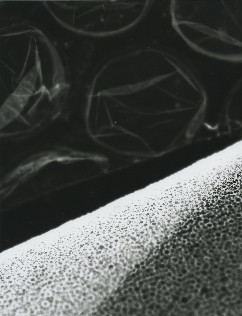
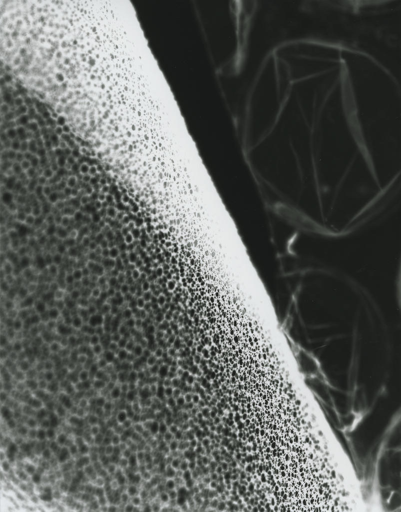
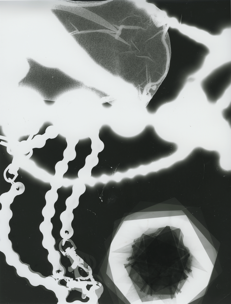
Here are a bunch of Fotograms I'm working on in my photography class. Eventually, I need to mount three photos (or a combination of photos). If anyone has any suggestions or ones they like or dislike please let me know! Also, can you guess what the objects are in the fotograms???


posted by Ali Piacente @ 11:56 AM
1 comments
![]()
![]()
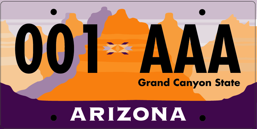
For my first project in Graphic Design 2, we created a redesign of the state issued license plate for a randomly selected state. For Arizona, I needed to research the state to find out its history, climate, facts, people, and more in order to find out what the most important thing about Arizona is. Arizona is known for its desert climate and tourism, which both stem from the Grand Canyon. When I think of Arizona, the first thing I think of is the Grand Canyon, and it is one of the seven natural wonders of the world.
I stayed in the same family of colors used in the previous license, purple and orange, in order to give the plate a desert, sunset appeal. Legibility was a key factor as well in creating the new plate. The symbol in the center dividing the numbers and letters is reminiscent of the population of Native American tribes living in Arizona, as well as giving the plate a "south-western" feel.
posted by Ali Piacente @ 11:01 AM
0 comments
![]()
![]()